Why SVG is not the best can opener
Jan 24 2005
Everybody’s raving about scalable icons. I know, I know, I was one of the first to put together an SVG icon theme when the Eazel guys added the functionality to Nautilus.
Scalable icons are great because they can save the artist a lot of work. In theory you should only have to do the icon once and let the application ask for the resolution it needs for the renderer to provide the pixmap. Also it’s easier to re-use parts of artwork (I’m finding a lot of Gorilla elements in other themes). In some cases it’s even faster than rendering a PNG. It’s great for simple style like Gorilla or. Once you add complexity, overlaid semi-opaque objects, objects with effects, the rendering speed drops.
But it’s not only the speed advantage that’s going away. As an example, look at the vectorized icons we have in Industrial. If rendered in the resolution for which it was designed, it looks just as sexy as the bitmap original, but if you scale it up, the strokes scale up as well and the icon loses it’s appeal. The icon style shifts. What’s worse, if you scale it down, it starts to look unreadable.


When you design a bitmap 16x16px icon, you have to simplify the artwork a lot. Not only by limiting the number of detail, but also by sticking to the grid more. The objects’ sides are orthogonal and if you do diagonals, they are usually 45°. Such strong perspective distortion, however only works for these tiny icons. There’s no need to do this at higher resolution and the icon would look odd in a higher resolution such as 48x48px.
![]()
Even if rendering an SVG icon at 16x16px will look crisper than scaling down a 48x48 bitmap down to 16x16, it’s never going to look as good as creating a special small icon. Even if some artists use the scaled down hi-res version as a starting point, they “tweak” it to make it fit the raster and make it readable.
It looks like Apple realised this for their latest applications. When OSX 10.0 came out, they had the small icons scaled down from a large resolution bitmap at application runtime. The high resolution is becoming a necessity with all these high resolution screens.
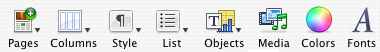
But in addition, in their following release, you see them creating special versions for the smaller resolutions (Althought it appears they mostly cheat with applying an unsharp mask). With Keynote and Pages toolbar icons you can see these being pixel-grid optimised.
 © Apple Computer.
So if you’re doing simple, comic-like style, which can be observed on Gorilla or Gartoon icon themes, you may truly save some work. The artwork is simple enough to survive being rendered at 16x16 or 24x24. The fact the outline is scaled along with artwork isn’t a defect, but a feature.
For a more realistically looking art you are left with no choice but creating special versions for most commonly used sizes. Yes, you could do the simplified orthogonal icon in vectors, doing pixel-precise work at the target output resolution, but what’s the point? If you scale it up, it may not be as blocky as scaled up bitmap icons (or fuzzy in most cases, when using interpolation), but it will look odd because of the perspective and wide stroke.
Bitmaps are not going to die. For toolbar and menu icons (16x16 px and 24x24 px), they are faster to produce and simply look better. There are more reasons why SVG icons are great, such as the posibility to make them accessible or easily recolor them on the fly. Having bitmap icons in the toolbars and menus isn’t just a relic of the past though. It’s a design decision. You can’t beat bitmaps at 16x16.


If you’re not familiar with SVG icons, Christian has written a nice overview of SVG support in GNOME in an OS News article while back.