Usable Desktop Wallpaper Techniques, Part 1
Sep 8 2005
Not long ago I have shown you how not to do a usable wallpaper. Well maybe it also makes sense to give a few tips on how to create a wallpaper that is usable and doesn’t get in your daily desktop usage.
The desktop is a highly exposed, fairly large area. Just like a work desk, people tend to personalize it. Apart from stuffing incredible amount of useless junk on the desk to be “within hand reach”, people put family or personal photo frames on their desk. Similar thing happens on the desktop. In GNOME, files from the web are downloaded there by default, most used application launchers are placed on the desktop and people tend to customize the wallpaper image as the first thing they do on a desktop.
Photos
In majority of cases, users will place a child or a partner photo on the background. As for computer geeks, nekkid chick does the job. If everybody changes the default to a photo, does that mean a desktop should ship with a photo by default? Hardly. The reason why people change their wallpaper is to make them comfortable; to feel “at home”. Using a photograph has major usability implications though.
A typical photograph has enough contrast to make the items on your desktop lose the visual dominance. Finding an item such as the recently downloaded file or an application launcher becomes harder.
Putting a photo of your loved one will seriously lower your effectivness as you will not want to cover his/her face with an application window! (Just kidding in this case ;).
So for a default wallpaper do we want to rule out photography as a whole? Not necessarily. Especially in the field of macro or abstract photography, you can find a plentitude of great wallpaper material. My fellow artist at Novell, Garrett LeSage, has a tremendous library of photographs, many of which are perfectly suited to be a usable desktop wallpaper. The attributes to look for are lower depth of field and homogenous, out-of-focus spaces.


Photography © Garrett LeSage
A photo is also a great asset to be edited furter to become a great wallpaper. Using various blur and overlay techniques, a photo that isn’t very usable as a wallpaper on its own can become a base for a highly usable wallpaper.
Generated Images
From the usability point of view, a solid flat color background is perfect. It is also pretty dull. Decent desktop environments allow to create a gradient instead of a flat color area. This works for some, but still bores most people I’ve had a chance to observe.
Handy Techniques
So what can can we create to spice up the desktop without hindering usability? Here’s a couple of techniques you may find useful in the process of creating a usable wallpaper. But first, let’s keep in mind what makes a wallpaper usable in the first place:
Homogenous Spaces. - try avoiding covering large areas with high contrast artwork.
Obstructed Areas. - when deploying elements such as logos or embeded photos, make sure you take obstructed areas into consideration. This depends on the desktop environment, but usually the top and bottom areas are occupied by a panel. All sides are very likely to be used for placing launchers and other items. The rule of thumb is that if at all, use the center of the screen for a logo.
Testing. - Never forget to test your wallpaper. It may look just fab when you press F11 to view it fullscreen in GIMP, but keep in mind you will have the desktop items and the panels and everything overlaid. So you want to apply the newly created image and check out your desktop.
Since the process usually takes a number of iterations, it may be more practical to create an overlay of your desktop items as a layer in GIMP to toggle when previewing fullscreen. To do this, apply some unlikely color to have on your desktop, such as pink as your background. Incidently this can be done by draging a color from the gimp palette or other color widget onto the desktop ;) Take a screenshot of your desktop and use color to alpha filter to get rid of the pink areas. Now you can use this image as a layer overlay on your actuall wallpaper.
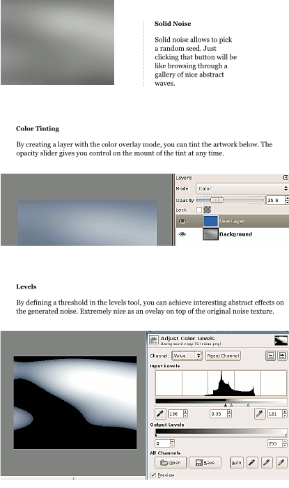
Solid Noise
Solid noise is in my opinion the mother of all abstract wallpapers. Without much work you can achieve a nice wavy texture to defeat the empty canvas syndrome and let the experimentation begin. Here’s a sample session to inspire your own experimenation:

Selective Gaussian Blur
While not too much of a problem on a photograph, having CCD noise on a desktop wallpaper is extremely annoying. This magical GIMP filter is a great help to get rid of the noise. Read my earlier entry for more pointers on how to use it.
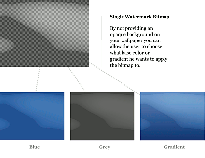
Watermarking
One feature of the gnome desktop with regard to wallpapers that isn’t widely used is the possibility to use semi-opaque RGBA “watermarks” on top of the flat color or gradient. This allows the user to keep the texture from the wallpaper bitmap while customizing the color or preference. Also useful for creating a watermark logo tile.