Jokosher Preview
Feb 14 2007
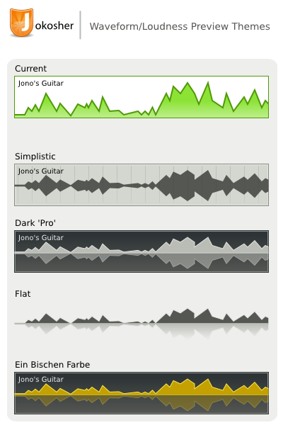
While enjoying Jono’s talk I didn’t like the appearance of the instrument loudness preview at first glance and I thought about how to make it prettier. I thought the 2px stroke is what makes this clunky. Yet there is something about the typical waveform preview that makes it both nicer to look at and thanks to the symmetry also giving you a better overview of the track.
It appears it actually helps to identify the really loud and silent parts better as it exaggerates the extremes. I’m not really having time to spare and don’t want to get involved, but maybe the following mockup could spark up some interest in making it a bit more polished?
The freesound integration is awesome! Inkscape and openclipart would be just as sweet.