OS2008
Dec 20 2007
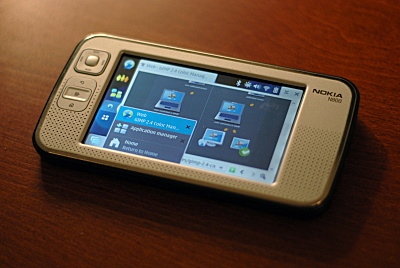
I grabbed the latest build of Nokia’s new firmware and I must say I’m impressed.
A very captivating background greeted me for the initial wizard. The widget theme doesn’t scream “Hey I’m the boring gtk+ you’ve been staring at for the last 7 years!”. And then the interface loads and I can enjoy the dark theme with its lovely monochrome status icons(Nice touch on the brightnes gauge, tig). When applications load, there’s no horrible flicker or repaints. Menus render instantly. Top level menus are in awesome dark grey. All in all the visual quirks have been ironed out and I feel like I’ve just been given a new device. Big props to the maemo developers.

And thanks for the sane start page for the browser. Now I wonder if the thumb keyboard is broken on purpose to make me want the 810 :)