Symbolic Moment
May 1 2010
![]()
It was almost 9 years ago when the first ever scalable icon theme Gorilla came to be. One of the things I imagined to happen soon after was that the icon theme would inherit the colors from the widget theme to really feel integrated. That part never happened. Until now. But this time it’s not for the default theme and not because of visual integration. In fact, with 2.30 we seemingly stepped back from SVG and started using bitmaps when we introduced the high resolution icons.
While we work hard on filling the gaps in the highly detailed, colorful gnome-icon-theme, on behalf of the gnome-art team I have proposed a new module for inclusion in GNOME, gnome-icon-theme-symbolic.

International symbol of marriage.
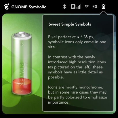
Unlike the default theme, the icons don’t scream with color and don’t become Times Square when few of them stay persistent on your panel. The simple symbols are mostly monochrome but in some cases they may include some color to emphasize importance. Unlike the Tango style or high contrast theme, the icons don’t include stroke tricks to make them legible on any background. Instead, the icons’ contrast is achieved the same way as it is done for text. The icons are simply rendered with the foreground color in the context of the widget where they are drawn in. Bastien has summed up the details of the implementation in his recent post.
The icon set isn’t an actual theme, it just extends gnome-icon-theme. It relies on the index.theme of gnome-icon-theme (or will). The reason why the icons live in a separate module is that we use a slightly different way to manage and “build” them. The complete theme lives in a single SVG plate (icons are outside of the canvas, try Inkscape). We then crop the plate into individual icons that are saved as plain SVGs (right after bug #419266 gets fixed that is ;). Sadly we do that using Inkscape’s verbs so the process is dead slow and pops up Inkscape windows while you’re trying be productive. But still the benefit of having the whole theme on one canvas is worth some pain.
Gtk+ then doesn’t actually load the icons directly, but they are wrapped in a gtk+ generated xml container that includes a CSS stylesheet that overrides the colors.
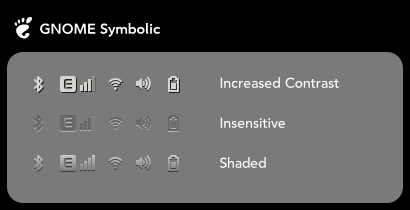
Of course for future the simple style still opens up room to apply fancy renditions. Just by rendering the icon twice, we can get a small shadow for increased contrast. Similar technique, but inverted can be used to render insensitive state of a widget, etc. Another big area where these may prove extremely useful is accessibility. All of this can be done at runtime, no need to deal with two or more icon sets.
We discussed these “dynamic” icons years ago and it’s a really big moment for me to finally see this implemented. And I believe no other system does this. FOSS innovation FTW!
Big thanks to goes to Matthias Clasen and Bastien Nocera for making it happen!
Update: I realised after a while that for some reason recaptcha was broken on my site. Comments are working now again, sorry to those who lost time writing to /dev/null :(