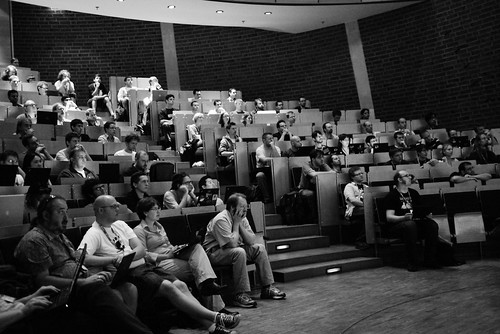
Guadec 2010
Aug 5 2010
 See the whole set
Took me a while to find some time to write up about this year’s GUADEC. I’ve done a bit of a pause and it’s been a bit different to what I recall. The first thing that stroke me is that I didn’t recognize a lot of the young crowd. Being one of the oldest in the conference is both great and a little depressing. But I choose to focus on the part that GNOME is a healthy project attracting young developers.
Design is in
I also sensed an increased interest in design. No more were we approached to provide some bling in the form of icons (hi Christian). We had a nice session with people from Epiphany project about page flow and tab organisation, “appification” of web pages and general role of Epiphany in GNOME. I made way too many promises, sadly.
The enthusiasm for involving design people gives me some hope the UX advocates project has a chance.
Shell Yes
Jon made a fairly convincing point that we lack a polished user experience, but also need to make a convincing experience for application developers. He also suggested a marketplace should be part of GNOME, and not let to fragment on the distro side, forming a viable application ecosystem. Learning from Android, Moblin/Meego or WebOS has been a thought that resonated with the audience.
Jon allowed me to demo some transitions from the new reskin we worked on recently. We may have freaked some shell developers a bit, but it really hasn’t been a dramatic redesign it may have appeared so at first. The greatest part was that Florian later showed us about 60% of the changes proposed implemented. Love when that happens. We had a good discussion about how to address some behaviour, mainly window to workspace and launcher related drag and drop. Expect some visualisations of that.
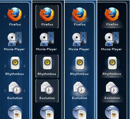 Iterating the indicator for running applications. Final design on the right.
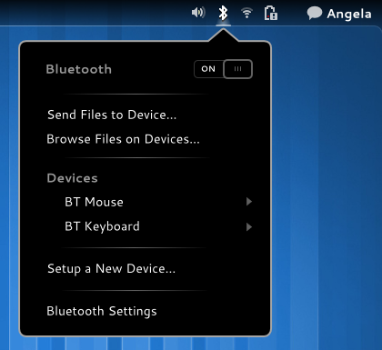 The same “spotlight” effect can be used for active system indicators.
You can follow all the design work as it happens in the gnome-shell-design module.
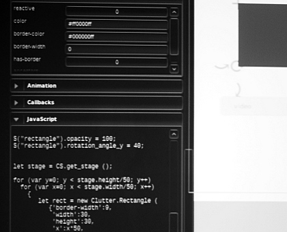
Cluttersmith
As always Pippin blew us away with some nifty demos of a visual design / prototyping tool built on top of clutter, Cluttersmith. Sadly it will be some time before we can taste the sweetness of rapid prototyping.
WM theme
I even got stuff done! Based on the work we did during the UX hackfest in London, and the pixmap based prototype Hylke has worked on, I’ve actually found time to start implementing the window manager theme. It’s currently not using any pixmaps at all, but there are some obstacles still ahead of us.
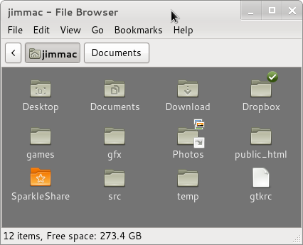
A much larger and important piece of the theming puzzle will be the widget theme (these need to work together).
There is a ton I have missed that I regret, mainly the design pattern focused new HIG BOF, but I have enjoyed this year’s Guadec a lot. So that was another Guadec a mythical Lapo Calamandrei didn’t attend. Maybe the next one. Thanks to all and the GNOME Foundation in particular.
