Killing Mode Switch
Jun 15 2011
As Allan already mentioned in one of his useful summaries, I’ve been pondering how how to improve the layout of the application picker in shell’s overview. While the mockup he showed does address the small click target problem, it still felt out of place with relation to the dash. I tried to apply different lipstick on it, but there was something inherently wrong with the layout and the overview lost its clean, “no boxes” feel.
The reason for the windows/applications toggle was easy extensibility. We thought of using shell to access people/contacts in the same way as we access applications. We thought to present documents in a better way without exposing the filesystem here as well. We thought the orthogonal arrangement ala Sony’s XMB would be fun on touch devices. Over time, I have come to the conclusion that extending the scope of shell might do more harm than good. I’ve never been a fan of all-in-one solutions ala iTunes.
Looking up people in a well designed contacts app might be an extra step to go through, but it won’t force us to kludge in some mode switching. We don’t yet have answers to finding & reminding, so I’m not stepping onto the thin ice just yet.

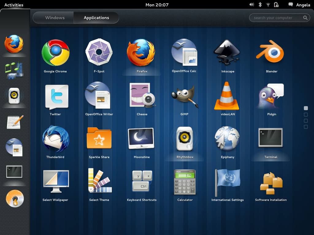
After some frobbing in Inkscape and Blender, I came out with a streamlined layout the overview, using a toggle button on the dash to expose ‘all apps’ for the less commonly used ones:
There are currently a couple of benefits to this approach — removing an item (favourite) from the dash is a matter of dropping it back to the ‘all apps’ pool without the need to show a temporary delete icon. We’re only removing it from the dash, not really uninstalling or deleting it. The ‘…’ button (“show me more…”) lives in the context of application launchers rather than arbitrarily floating in space.
You probably noticed the app picker here uses a pager instead of a scrolled view. Obviously this would require the apps to not be auto sorted and we would have to give the user the ability to sort the list. That way the pages would aid us better when finding a less frequently used app (“I know it’s down here among X and Y”).
How the transitions feel adds to the experience. I was aiming to have the launchers behave like a swarm when you toggle the button on and off. Sadly Blender trunk seems to misbehave with regard to the follow path constraint, so I have to punt that for now.
I regret we didn’t have time to go through this iteration before the 3.0 release, but I think the change is worth the pain.