In Defense of GNOME Icons
Mar 11 2013
Recently I saw a few people commenting along of ‘GNOME 3 icons being crap’ so I investigated what the actual core of the issue might be. When dissing the years of work that went into creating the system theme and pushing app icons upstream, most of the commenters seem to actually have a problem with the folder icon.
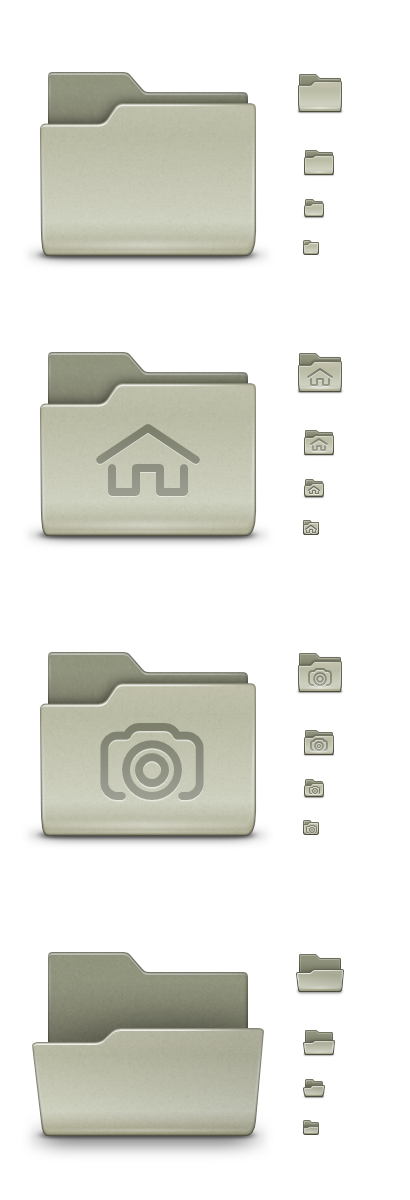
The GNOME folder is a result of using the actual beige color that is both the real world folder material, and the legacy of Tuomas’ GNOME 1 folder. Easy things are hard so it’s a result of endless iteration with my soul mate, Lapo Calamandrei, to get the icon look great at the small sizes, but also to have the icon snap to the render grid well for the common high res sizes (64, 96, 128, 256). It repeats well in a grid. I feel the voices disliking the beige folder are the same voices disliking the grey folder in the original Tango set. We ended up listening to those folks and changed it to blue, but I ended up regretting the decision.
The blue folder grabbed way too much attention for something that’s used when browsing for the actual content. While a lot of effort went into making the folder, we don’t actually expose it all too much. Exposing the directory structure is the pre-GNOME 3 world. What we focus on now are the applications.
Which is actually the other issue people seem to attribute to “GNOME sucking”. It is true that the current reality of opening up the overview is quite different to the ideal mockup.
![]()
Many apps ship with very sub par application icons. One of the solution to this problem is to “take over” the theming of Application icons. We have been there in the past and just like taking over app distribution by distro packaging, there is a lot to lose when you centralize something that should really be left to the application authors. The app icon is the app’s identity. Sure it’s more difficult to convince the upstream to take your work despite it not being created by an algorithm, but taking away a project’s identity in the name of policing the aesthetics of the overview is not the right approach. We toyed with the idea of forming a blacklist and buttonizing some icons in prior to the 3.0 release, but came to the conclusion we should help app authors with guidelines and design help instead. For the life of me, can’t find this on the wiki anymore. We’ve been successful in pushing app icons upstream for projects such as Inkscape, GIMP, Blender, Transmission and helped other projects such as Font Forge to create a multi-resolution icon adhering to the Tango guidelines. Another aspect of taking over all app icons by overriding them with an all-encompassing theme seems to be “consistency”. The word is used in a sense that the icons share a common shape and perspective. Now while that makes them form a really nice grid, it goes against the most useful attribute of a good icon – being distinguishable form the rest. I love the challenge of being restricted to a button shape and I’ve certainly drooled over some of the smart icons fitting into a rectangle pill, but a unique silhouette is really helping in identifying the app in the grid.
We do have a wider choice for the perspective in the Tango guidelines. Experience has showed us some objects simply can’t be made immediately distinguishable facing straight, so the on the table perspective is used sometimes. But that doesn’t suddenly make the set inconsistent.
To make myself clear, the icons aren’t perfect. We have a lot of issues to fix, but I felt I needed to express my stance on the repeating comments.